Spotify temporarily updated its logo for the 20th anniversary of the service
15 may 2026 в 22:13
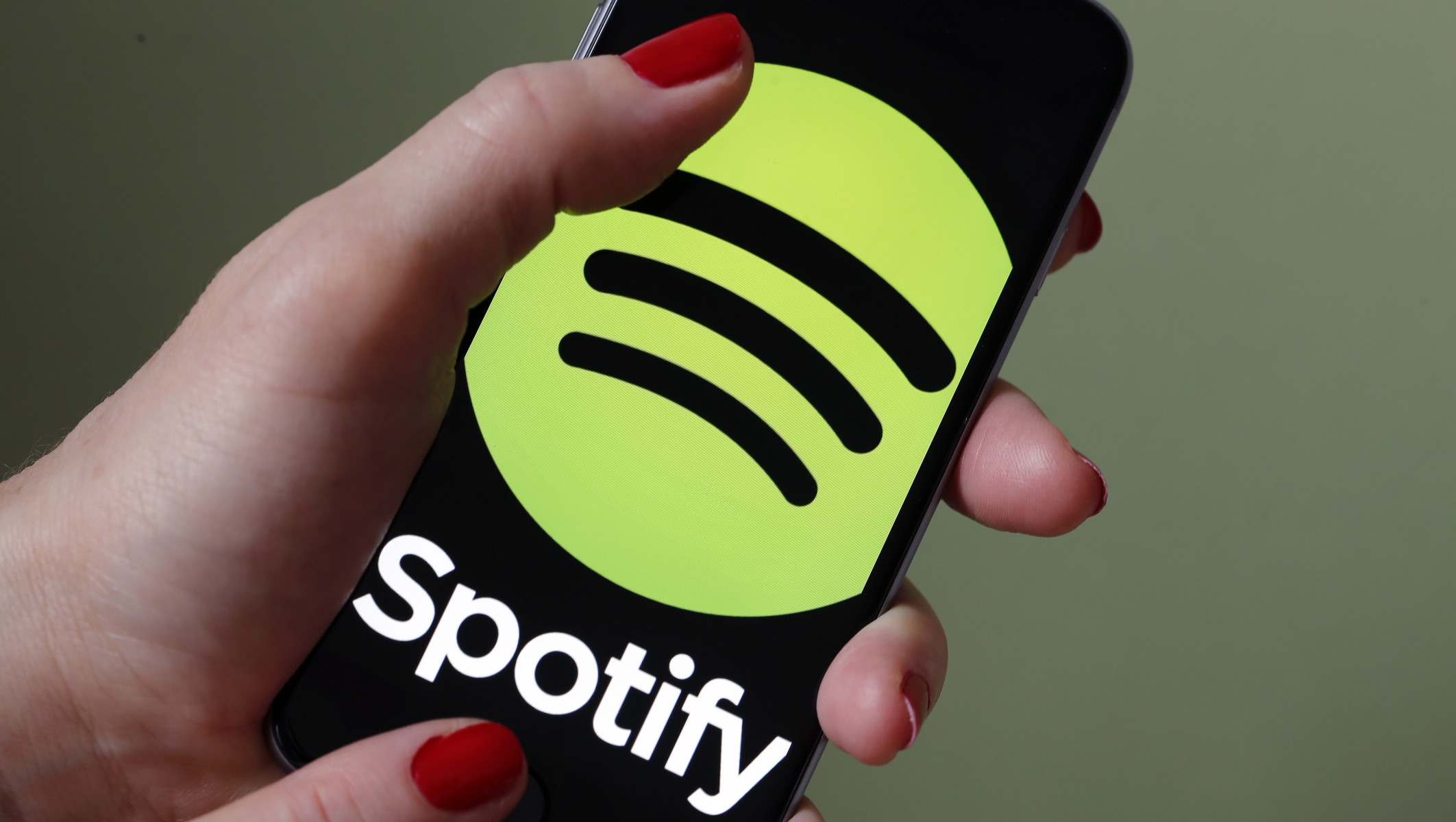
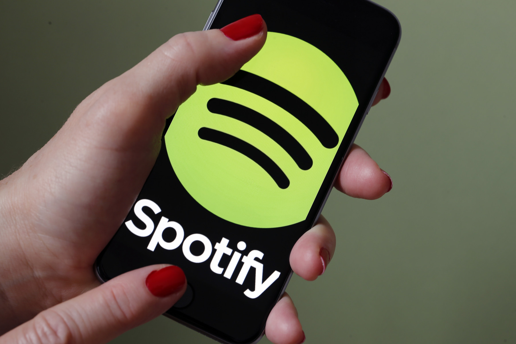
Spotify users were surprised when the familiar green app icon suddenly updated to resemble a sparkling disco ball. Social media quickly filled with questions like «Why did Spotify change its logo?» and «Is the new Spotify logo permanent?» It turned out that the dramatic redesign was not a mistake or a complete rebranding, but why did Spotify change its icon?
Here’s what we know about this design change.
Spotify updated its logo—at least temporarily—to celebrate its 20th anniversary. The campaign, officially named «Spotify 20: Your Party of the Year (s)», - offers users a personalized collection of their musical preferences over the years, including their first songs listened to and favorite artists.
According to reports related to the campaign, Spotify wanted the anniversary to feel more like a global music party rather than a boring corporate event. That’s why the disco ball theme was chosen. Since disco balls are associated with nightlife, dancing, and music, Spotify apparently wanted to emphasize these themes to unite its users.
The logo redesign actively leans into nostalgia, music culture, and celebration. Instead of completely abandoning its design, Spotify retained its iconic sound waves embedded in the disco ball icon.
For users concerned that the original logo would disappear forever, reports indicate that the disco ball icon is temporary. The redesign is likely tied specifically to the «Spotify 20» celebration.
However, Spotify has not publicly confirmed how long the disco ball icon will remain active on devices.
Fans did not hold back in criticizing the new disco ball icon. Many expressed their dissatisfaction directly in response to the platform’s tweet that read, «Isn't it beautiful?»
«No, it looks like absolute garbage», - wrote one user on X in response, adding, «Fire your entire design team and sue them. They need to be locked up».
Others urged Spotify to bring back the old logo as soon as possible, with one user writing, «Please bring back the old logo. This looks like a mistake»
Here’s what we know about this design change.
Spotify updated its logo—at least temporarily—to celebrate its 20th anniversary. The campaign, officially named «Spotify 20: Your Party of the Year (s)», - offers users a personalized collection of their musical preferences over the years, including their first songs listened to and favorite artists.
According to reports related to the campaign, Spotify wanted the anniversary to feel more like a global music party rather than a boring corporate event. That’s why the disco ball theme was chosen. Since disco balls are associated with nightlife, dancing, and music, Spotify apparently wanted to emphasize these themes to unite its users.
The logo redesign actively leans into nostalgia, music culture, and celebration. Instead of completely abandoning its design, Spotify retained its iconic sound waves embedded in the disco ball icon.
For users concerned that the original logo would disappear forever, reports indicate that the disco ball icon is temporary. The redesign is likely tied specifically to the «Spotify 20» celebration.
However, Spotify has not publicly confirmed how long the disco ball icon will remain active on devices.
Fans did not hold back in criticizing the new disco ball icon. Many expressed their dissatisfaction directly in response to the platform’s tweet that read, «Isn't it beautiful?»
«No, it looks like absolute garbage», - wrote one user on X in response, adding, «Fire your entire design team and sue them. They need to be locked up».
Others urged Spotify to bring back the old logo as soon as possible, with one user writing, «Please bring back the old logo. This looks like a mistake»
© Puhova Marina